Making a Palette with the Color Blindness Simulator
There are colored threads in our upcoming game. I wanted each to look distinct to everyone, including players with a color deficiency. After some research on the world-wide-web, I felt like I could make it work.
I found explanations of the eye's rods and cones, types of vision deficiencies, related population statistics, and several pre-made color palettes. But I also found a research paper, Color Design for the Color Vision Impaired, showing color spectra seen through different types of vision, and that got me really curious to try something.
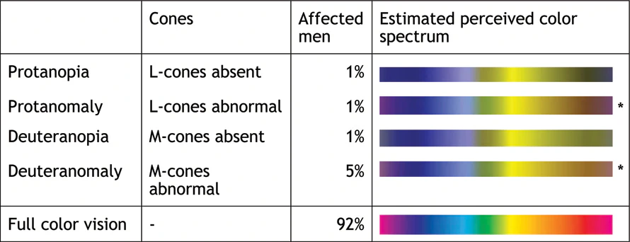
From Color Design for the Color Vision Impaired
Within each spectrum I could spot unique bands of color. Where they overlap should give a set of colors visibly unique to almost any person.
I marked the color bands that I saw, and they lined up well in most cases. Orange and blue are a weaker match, but it seemed like a good starting point. It reminded me of a pre-made palette I had seen.
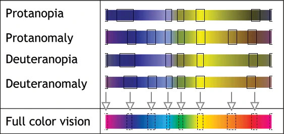
Where I see unique colors
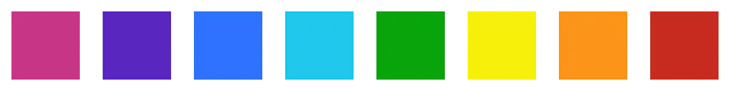
To make a palette, I put the hues on squares and got fixated for hours adjusting saturation and lightness. For longer than I should have, it turned out.
That's because my perception changed a lot when I put the colors on threads, and in low-light on my phone screen. It was a reminder that I'm no color expert. I needed threads distinct in all situations, so I made multiple thread shapes and tweaked colors again. This whole process took a couple weeks.
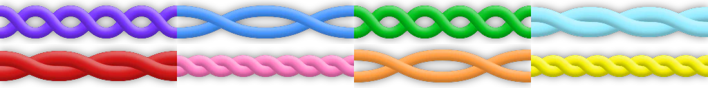
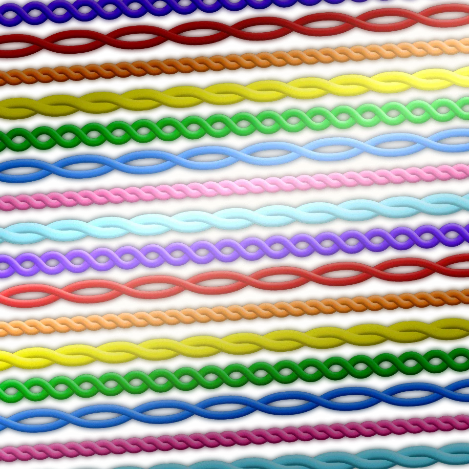
The threads we settled on (so far)
Along the way, I used a wonderful color blindness simulator web page called Coblis, and filters that Geri Borbás made from it. I could see my graphic work live through the Coblis filters1.
Here are the threads with simulated low green reception, the most common color deficiency (they look nearly identical in low red, surprisingly).
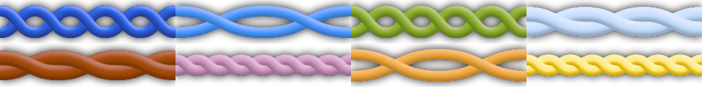
Simulated low green reception
Actually, I'm adjusting colors again as I write this. We just got feedback from a friend with low-green reception. The filters aren't perfect, so it's great to have real feedback.
Here the threads are with green total-blindness simulated. It's good we have different shapes.
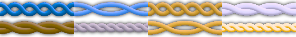
Simulated green blindness
Low blue reception is rare but interesting for comparison.
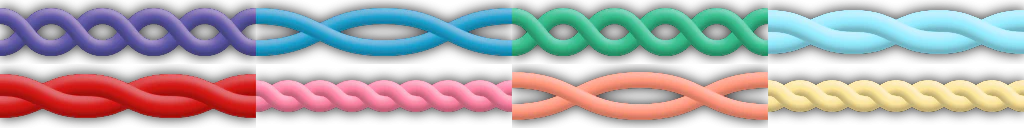
Simulated low blue reception
An interesting table based on Types of Color Blindness:
| Type | Science Name | In Men | In Women |
|---|---|---|---|
| Low red | Protanomaly | 1.08% | 0.03% |
| Low green | Deuteranomaly | 4.63% | 0.36% |
| Low blue | Tritanomaly | 0.0002% | |
| No red | Protanopia | 1.01% | 0.02% |
| No green | Deuteranopia | 1.27% | 0.01% |
| No blue | Tritanopia | 0.0001% | |
| Monochrome | Achromatopsia | 0.00003% |
Whew, I'm so glad the threads are done! Please let me know if there's something important I missed.
Anyway, this somehow relates to a word game. I promise!
-
By putting the .cube files on LUT adjustment layers in Affinity Designer. ↩